Square Charger
Case study
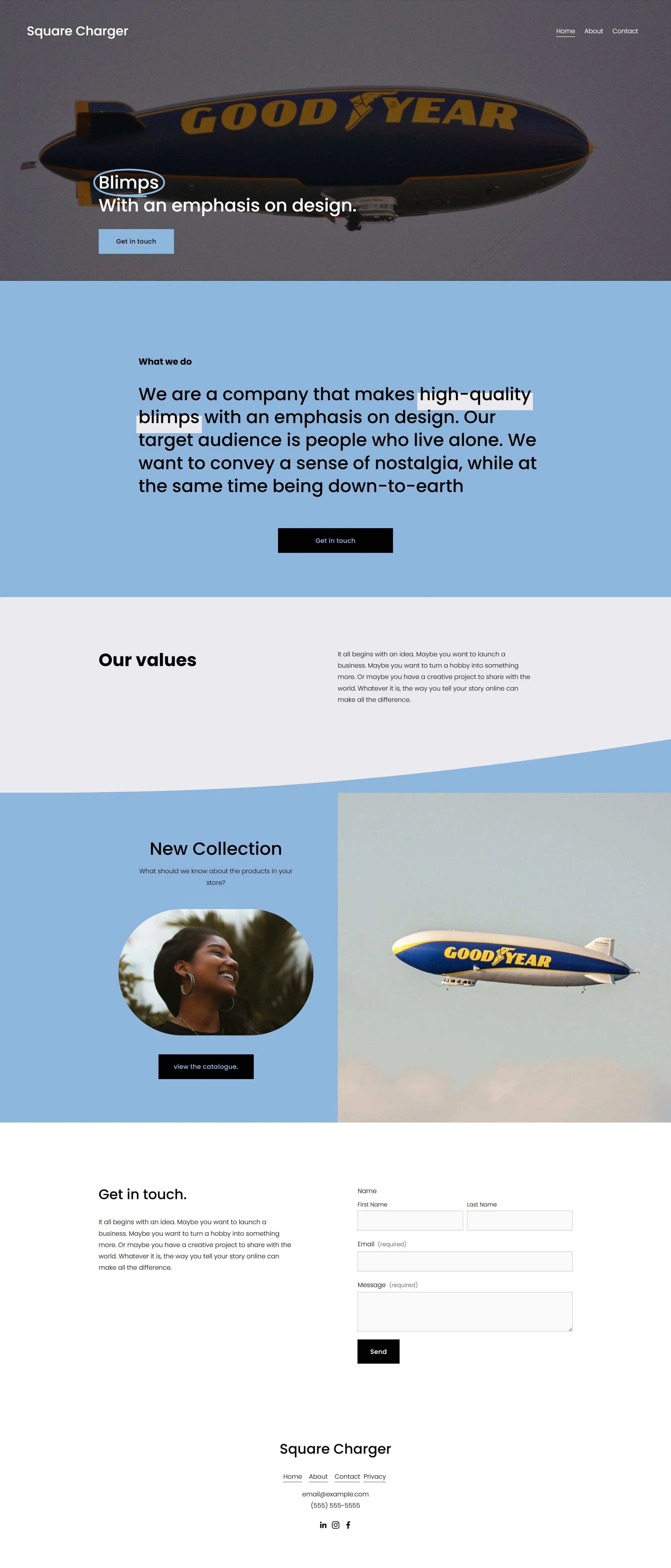
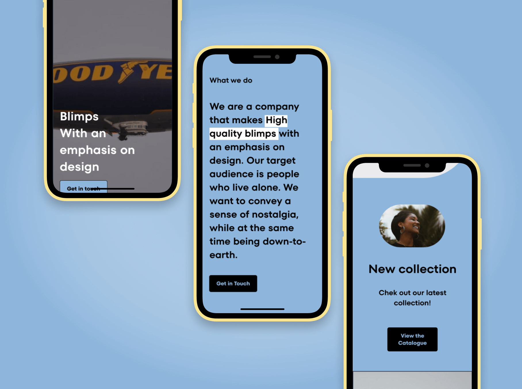
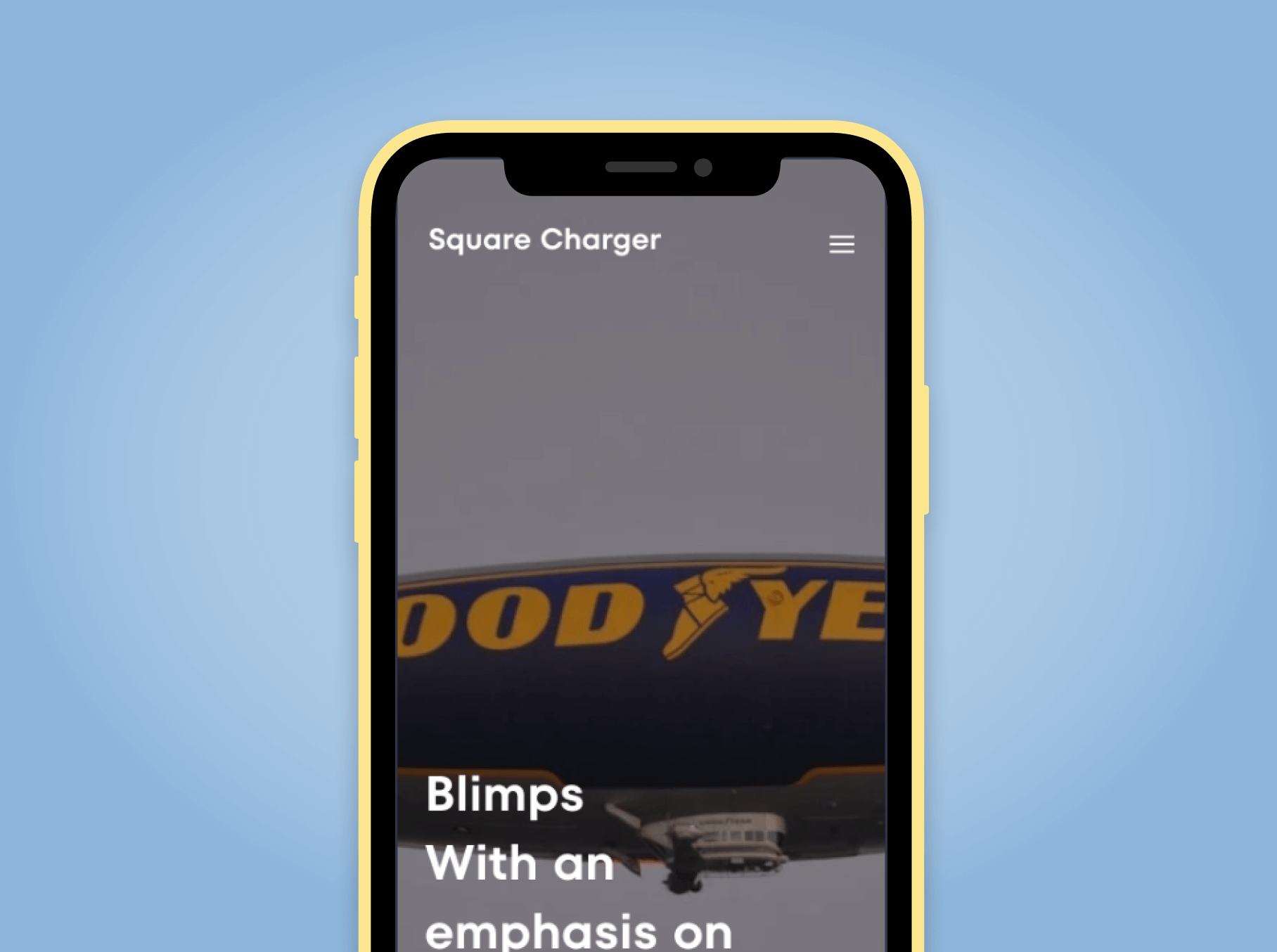
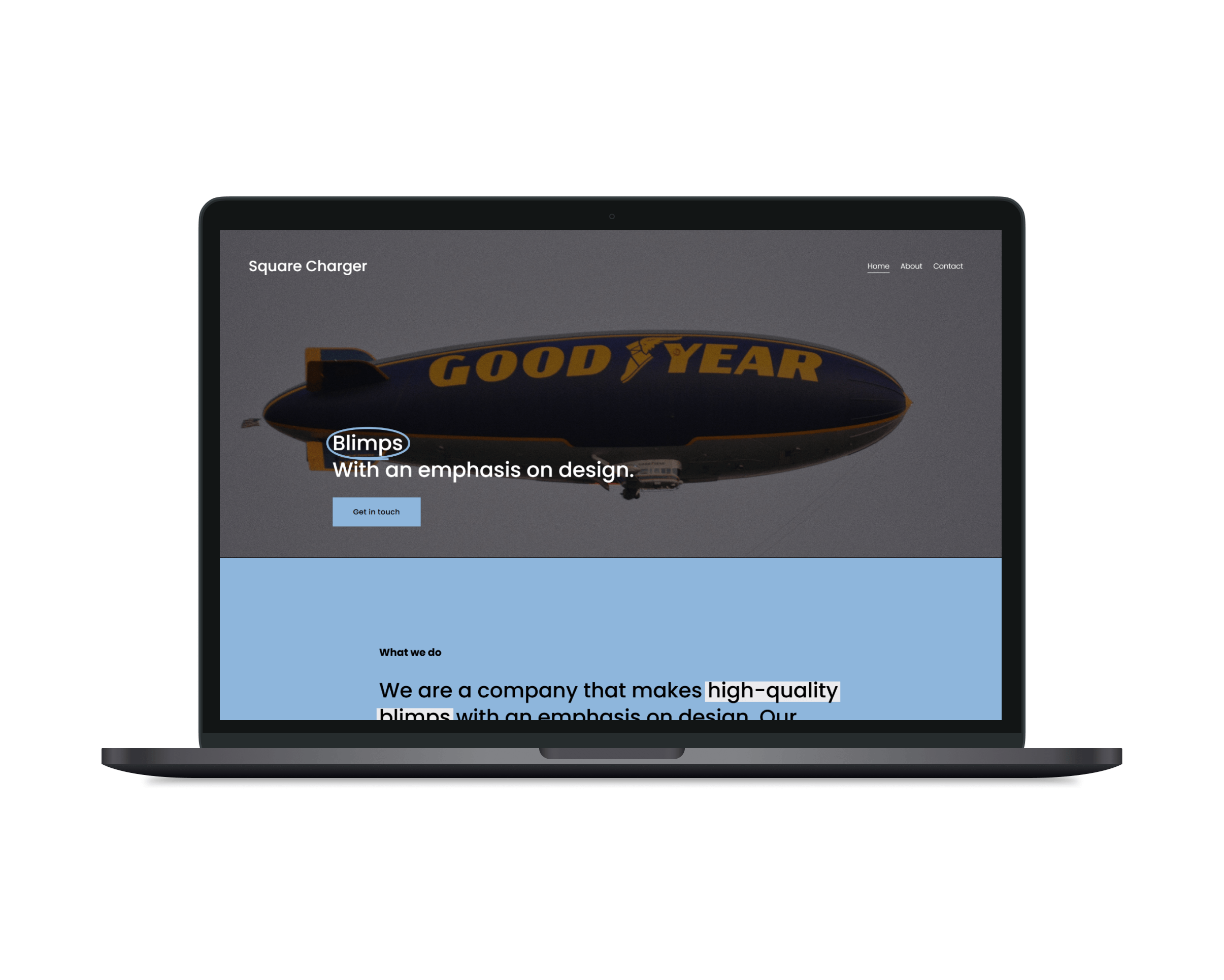
Square Charger is a specialised aviation company that builds custom blimps for research, aerial experiences, and advertising. Their original web presence didn’t reflect the quality of their offering, it lacked mobile support, had scattered messaging, and wasn’t converting well.
They needed a modern, professional site that would build credibility and generate leads, across all devices. I worked with their internal stakeholders to design and launch a fully responsive website that combined high-trust visuals with a clearer user journey.
Industry:
Special-purpose aviation
Project:
Square Charger
Role: Sole designer and implementer; led content structuring, designed all pages in Figma, built live site in Squarespace
Type: Client project — responsive marketing and lead-gen site for a technical B2B service
Timeline: 2.5 weeks
Tools: Figma (for visual design, page layouts, and image treatment), Squarespace (for implementation and CMS), brand and goal alignment through client collaboration