Reno - Home Renovation
Case study
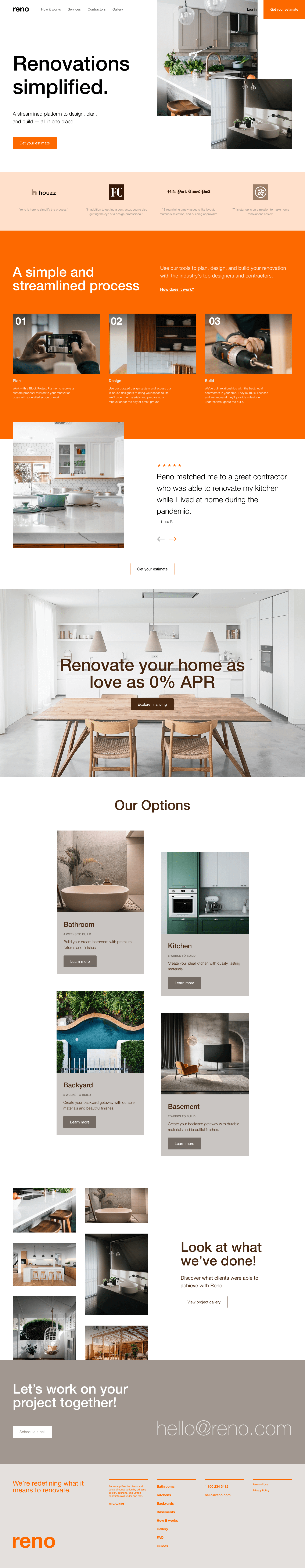
The home renovation process can be overwhelming, even before the first hammer swings. Reno is a concept project I created to explore how a clean, well-structured website could make that process feel simpler and more approachable for everyday homeowners.
The idea behind Reno was to combine everything a user might need; planning, design, and building, into one seamless experience. I designed a responsive marketing website that clearly explains the service, builds trust through testimonials and visuals, and guides users to take the next step (like getting a quote or learning more about service types).
From layout sketches to full UI design, this project was about making something that feels high-end but still easy to use—blending professionalism with a down-to-earth tone.
Industry:
Home renovation / residential services
Project:
Reno
Role: Solo full design process, including layout strategy, wireframes, UI design, and content flow. Built the full site in Squarespace
Type: Concept website — designed to show how a renovation brand could simplify their messaging and boost client trust
Timeline: 4 weeks
Tools: Figma (for visual design, layout planning, and flow mapping), Squarespace (for responsive build and content updates), direct client discovery